Clear space, the smallest it may go, and the six things that break it. Each pair below is the real lockup, correct on the left and wrong on the right.
✓Clear spaceKeep the height of the mark clear on all four sides. Nothing crosses that line, including the edge of the page.
150px minimum for the lockup
28px for the mark alone. Below that, use the mark, never the lockup
150px
✓Minimum sizeShown at real size. The wordmark stops being legible before the
mark does.
✓Full opacity
✗Never fade itSubtlety comes from size and position. A faded mark just looks broken.
✓Both axes together
✗Never stretch itScale both axes together. Fit by height, then crop the ground.
✓An approved treatment
✗Never recolour itThere are four approved treatments. Recolouring makes a fifth.
✓Flat art
✗Never add effectsNo shadow, glow, bevel or outline. It is flat art.
✓On the horizontal
✗Never rotate itThe lockup sits on the horizontal, on every surface.
✓Clear space kept
✗Never crowd itThis one breaks the clear space above. Give it room or leave it out.
03Colour
Click a value to copy it. Every swatch carries both the hex and the rgb triple, because half the surfaces here want one and half want the other.
Ground and ink
canvas
sidebar
content
ink
ink muted
On dark
ground
on dark
on dark muted
Accent, one meaning only
accent
blue (system)
green (system)
04Typography
Inter carries every paragraph; JetBrains Mono is reserved for numbers and data — stat tiles, keyboard hints, tags. Newsreader (serif) is loaded but not yet used anywhere live; drop it from the stack until it earns a job.
Built from the tokens above. Click to copy the CSS.
Primary
On dark
Quiet
DesktopThe outer window chrome
SidebarNavigation
ContentThe notes/cards surface
InkDark mode desktop, avatars, the app icon
06Applications
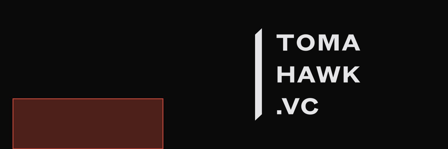
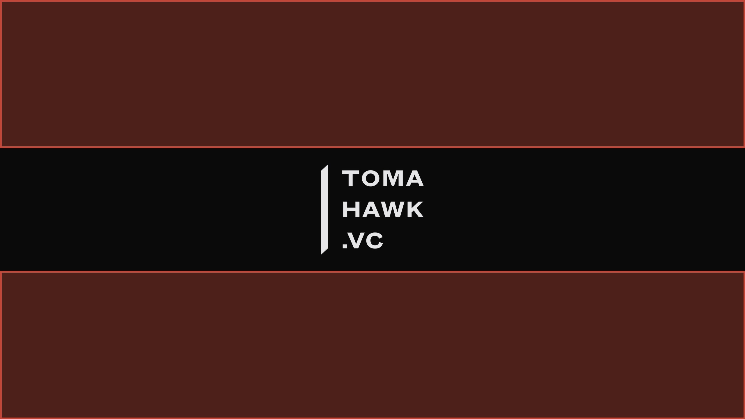
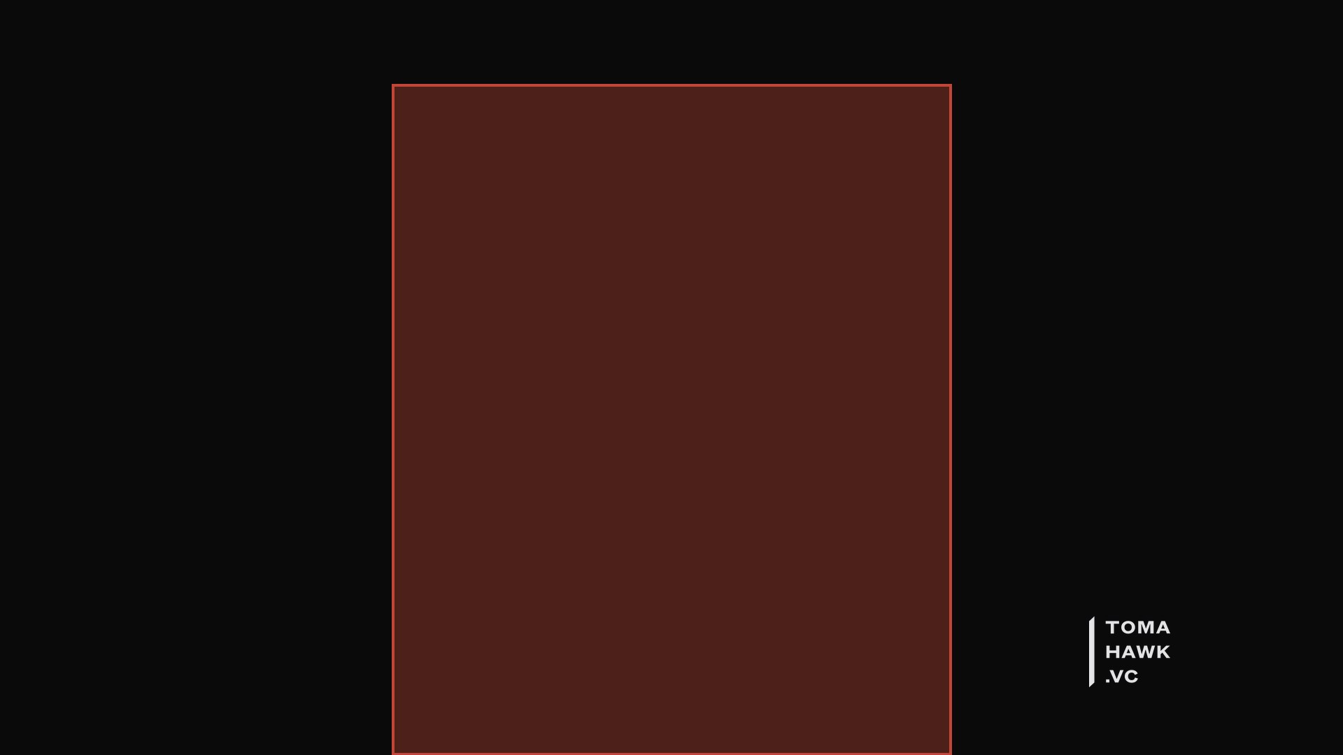
The brand on the surfaces people meet it on. Shaded areas are where each platform stamps its own avatar or crops: measured against live pages by gtm/social-profile-assets, not taken from a published guide. The downloads are the clean files without the shading.
linkedin page cover4200 × 700 · Logo tile eats x0-1750 below y250, and grows to 40% of the width at a 360px viewportDownload PNGx header1500 × 500 · Avatar union is x42-546, y330-500; mobile web keeps only x352-1148Download PNGyoutube banner2560 × 1440 · Only x507-2053, y508-931 is safe on every deviceDownload PNGog card1200 × 630 · Open Graph, so this is the Slack and WhatsApp unfurl too. Keep the bottom 80px clear and stay under 600KB, which is WhatsApp's limitDownload PNGgithub social preview1280 × 640 · Repo Settings, Social preview. GitHub rejects anything over 1MBDownload PNGplay store feature graphic1024 × 500 · Play Console header, 1MB ceiling. The store draws the app title across the top strip, so nothing of ours goes thereDownload PNGslide title1920 × 1080 · Deck opener at 16:9Download PNGslide content1920 × 1080 · Body slide. The lockup sits small and bottom-left so it never competes with the contentDownload PNGvideo call background1920 × 1080 · Zoom, Meet and Teams. The shaded box is roughly where a head sits, so the mark goes to a bottom cornerDownload PNGemail signature1200 × 218 · 2x retina; scale it to 600 wide in the clientDownload PNGdocument header2480 × 400 · A4 at 300dpi, for letterhead and contractsDownload PNG
07Writing the name
Tomahawk.VC, period before VC, both capitalised. First mention in a document uses the full form; after that, Tomahawk alone is fine.
Lowercase tomahawk.vc only in a domain, handle or repo name.
The tagline is three short beats, always with periods, never commas: “Faster. Deeper. Further.”
The mark is the single blade cut into the wordmark's left edge — call it the mark, not a slash or bar. In the fund's own words: “The scar on the logo isn't decorative.”
08Downloads
The vector masters first: regenerate from these, never hand-edit an exported PNG. Everything else is derived from them by the generators.